

Canva Brush: Restyle a Poster's Colors and Check the Copy
To restyle a poster with Canva Brush, define the new colors by their jobs: background, text, and accent. Then name the wording and artwork that should stay, and compare the revision with the approved version. A request to keep something unchanged is an instruction you must check afterward.
For CanvaBrush readers who already have a finished poster, this guide focuses on one palette change. It does not resize the design or rewrite the event message. Canva's Brush announcement identifies color-scheme changes as a restyling example and says the resulting design elements remain editable. The workflow below is an editorial method based on that documentation, with original examples rather than an account-level Brush test.
Decide what the new colors should do
Suppose a fictional pottery studio has approved its open-day poster. The illustration, event details, and composition are ready; the team wants a warmer cream-and-navy version for the next campaign.
Keep a copy of the approved design and a short text record before starting. For this example, the approved copy is:
STUDIO OPEN DAY
SAT 21 NOV
BOOK A PLACE
In a real project, include all the factual details, including the year, time, location, and booking address where applicable. Copy them from the approved brief rather than from memory.
Assign a role to each proposed color. “Use cream, navy, and terracotta” leaves open whether a color belongs on the background, small text, or a decoration.
| Design role | Example instruction | What to compare afterward |
|---|---|---|
| Page background | Warm cream, #FFF4E6 |
The main text remains easy to distinguish |
| Essential text | Deep navy, #152A44 |
Headline, date, and action line retain their wording |
| Decorative accents | Terracotta, #B64B32 |
Accents support the message without obscuring it |
| Existing illustration | Retain the ceramic-bowl artwork | Shape, color details, and placement match the approved version |
The hex values make the intended palette explicit. They do not establish that Brush will reproduce those values exactly; inspect the actual element colors after the edit.
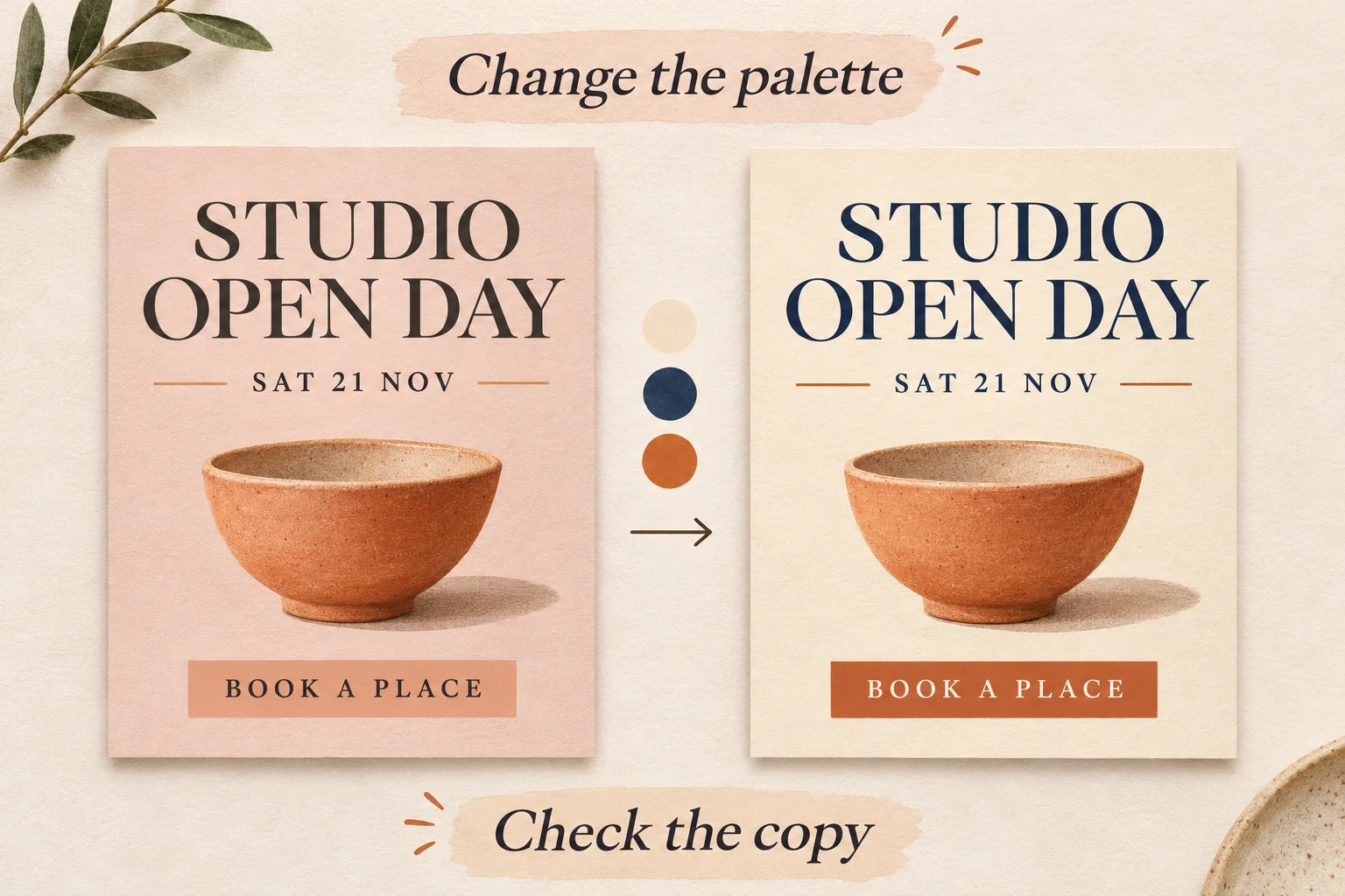
Original AI-generated concept illustration, not a Canva interface screenshot or a Brush before-and-after test. Matching content illustrates the brief, not a guaranteed preservation feature.
Give Brush one clearly bounded request
Canva's launch guidance says to open an existing design in the editor, or attach or link a design in Canva AI, and select Brush from the dropdown. It describes supported edits launching for Canva Pro subscribers. Check your account's current options in Canva AI before relying on that path.
For the fictional poster, start with this instruction:
On this single-page studio poster, change the page background to warm cream (#FFF4E6), the headline, date, and action-line text to deep navy (#152A44), and the decorative accents to terracotta (#B64B32). Keep every word exactly as written. Retain the existing ceramic-bowl illustration, its placement, the page size, and the current text hierarchy. Do not add new copy or decorative elements.
Adapt the named elements to your design. If a logo or photograph must retain its original colors, say so specifically. Avoid combining a palette change with a new typeface, layout, and image treatment in the same first request: each additional change adds something else to review.
The launch announcement lists Brand Kit support among ongoing work. This example therefore supplies the palette directly instead of assuming automatic Brand Kit application. Confirm current controls if your project depends on that feature.
Review the text before approving the style
Compare the revised poster with the saved reference. Start with the information that would cause a real problem if changed: dates, prices, names, and booking details. Read the text character by character, then check line breaks and placement.
A visually attractive revision can still need correction. For example, an action line that wraps onto two lines may crowd the date even when every word is correct. Check the illustration and any logos separately; a request about page colors should not quietly become an artwork revision.
If the copy changed, correct that issue before exploring another palette. If several unrelated elements changed, return to the approved reference and narrow the request rather than building further revisions on a version you have not accepted.
Check the actual text-and-background contrast
A palette that looks harmonious can make small event details difficult to read. Check each text color against the background directly behind it, especially when text sits on a photograph or colored badge.
The W3C explanation of WCAG contrast requirements specifies at least 4.5:1 for ordinary text and 3:1 for large text. Large text has a defined size threshold; a prominent-looking heading does not automatically qualify. For this poster exercise, aim for at least 4.5:1 for all essential copy as a practical starting check.
For the exact solid colors in our proposed palette, navy #152A44 against cream #FFF4E6 calculates to approximately 13.37:1. This is a calculation for those two color values, not a measurement of a Brush result. If the editor uses different colors, opacity, or a different background, check that actual combination again.
A passing color pair does not establish that the whole design is accessible. Also inspect text size, weight, spacing, and the final viewing size. For online sharing, provide the essential event details as readable accompanying text rather than relying on the poster image alone.
Make a small correction, then inspect the export
Canva says Brush designs remain editable, so the final correction can happen in the editor. If the palette is right but the date is faint, adjust that text element or make a focused request:
Change only the date line to solid deep navy (#152A44). Keep its wording, size, and position unchanged. Leave the rest of the poster as it is.
Compare again after the correction, then inspect the exported file at the size your audience will see. Keep the approved version alongside it until you finish the review.
This single-page workflow is different from making a consistent update across a deck; our multi-page heading guide covers page scope and exceptions. If the task instead involves converting the poster or a slide into another placement, use the slide-to-social workflow to decide what content belongs in the new format.
Perform the Brush step in Canva AI. Canvabrush.com's image tools and credits are separate from Canva account access. Begin with one poster, one palette, and an approved text reference; finish the copy and readability checks before adapting the rest of the campaign.
Written by CanvaBrush Editorial. Canva's Brush announcement and W3C contrast guidance checked November 4, 2026. Prompts and studio details are original examples; no account-level test, automatic preservation guarantee, or accessibility certification is claimed.